ShopDreamUp AI ArtDreamUp
Deviation Actions


Suggested Deviants


Suggested Collections


Description
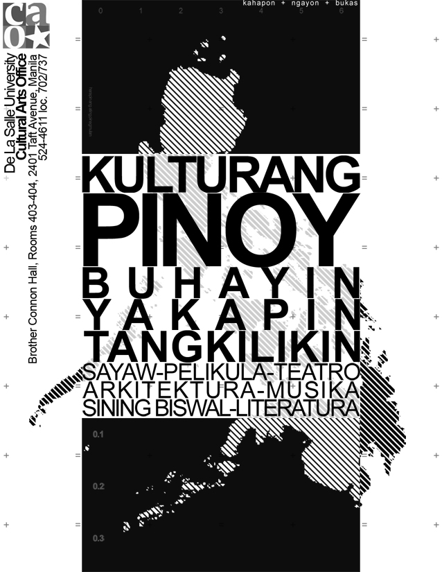
the second of the studies made for the DLSU-M Cultural Arts Office.
i personally like this better among the two because well... im a pillar neat kind of guy") not to mention i spent more time doing this bleh >.>
not to mention i spent more time doing this bleh >.>
again u can see the striped Philippine map in the background but this one has more variation to its shades. oh and no jeepney this time
cleaner looking but might not have the same impact as the first one. oh well")
translation of words:
Kulturang Pinoy = Philippine Culture
Buhayin = to bring to life
Tangkilikin = patronize
Yakapin = to embrace
sayaw = dance
musika = music
arkitektura = architecture
sining biswal = visual arts
literatura = literature
pelikula = movies
teatro = theatre
i personally like this better among the two because well... im a pillar neat kind of guy
again u can see the striped Philippine map in the background but this one has more variation to its shades. oh and no jeepney this time
cleaner looking but might not have the same impact as the first one. oh well
translation of words:
Kulturang Pinoy = Philippine Culture
Buhayin = to bring to life
Tangkilikin = patronize
Yakapin = to embrace
sayaw = dance
musika = music
arkitektura = architecture
sining biswal = visual arts
literatura = literature
pelikula = movies
teatro = theatre
Image size
638x825px 180.17 KB
© 2006 - 2024 Messymaru
Comments13
Join the community to add your comment. Already a deviant? Log In